Introducing: Your Bento, Only Better
Company Updates
We have a new look!
We are so excited to unveil the new Bento for Business! It includes a complete redesign of the Bento interface to enhance your experience, plus more useful features to support your business.
Watch this video where we show you what we mean:
Enhancements included in this redesign:
Fresh, streamlined interface. Bento’s beautifully simple interface brings in easier controls and more streamlined workflows, reducing almost every in-app action to two clicks or fewer.
Improved visibility of important information and controls. Spend less time scrolling, clicking and searching for things! Your alerts and various control options are now more easily visible and accessible. We also redesigned the way information is displayed, so there is less clutter on your screen.
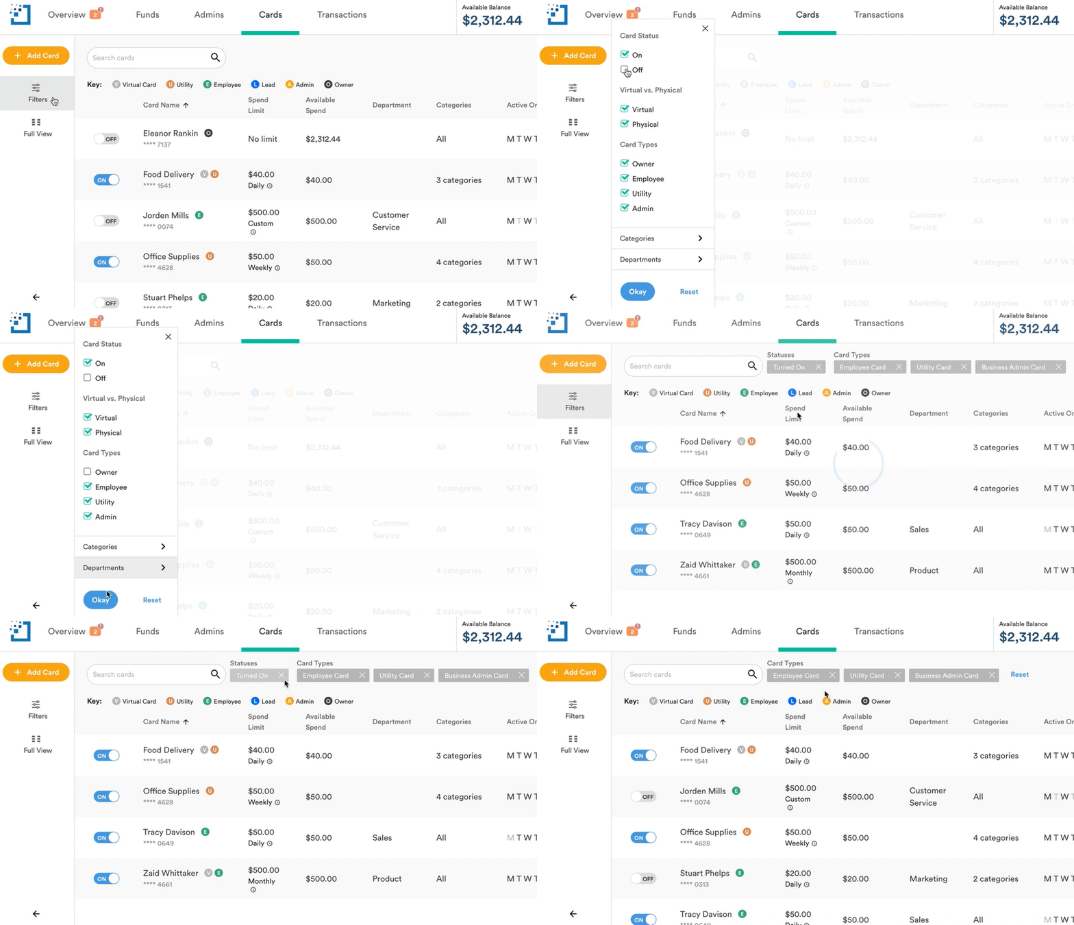
More robust search and filtering capabilities. Using our flexible transaction filters, it’s now easier than ever to build expense reports exactly the way you like. Even better, we’ve introduced the same search and filtering capabilities to the Cards section.
It’s kind of fun to use:
We can’t wait for you to start using the new Bento and tell us what you think. Check it out by logging in or signing up today.
From the entire team at Bento for Business, thank you for your continued support! Stay tuned for more updates (big ones) from us soon.


 Analytics & Reporting